Paddenstoelenbos
A bilingual site for a mushroom forest that changes colour with the season it actually is.
A rebuild of the website of Stichting Paddenstoelenbos, a foundation in Weert (NL) that grows biodynamic mushrooms. In development; paddenstoelenbos.nl still runs the old site.
- Sector
- Foundation · Mushroom forest
- Year
- 2026
- Services
- Web design, Development, Content migration, Accessibility
- Stack
- Next.js, React, Tailwind CSS, TypeScript, three.js, Vercel
(01)The idea
The old site was one long page. People came to find out when the next workshop is, whether they can pick mushrooms, and how to join in, and had to scroll past everything else to get there. The rebuild had to give each of those a real address, keep the foundation's own words, and still feel like a forest the people who run it call magical.
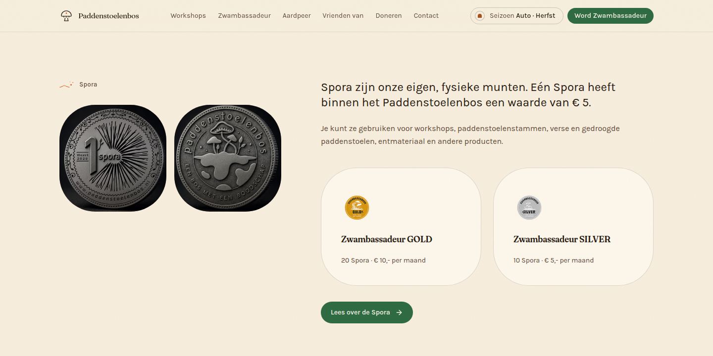
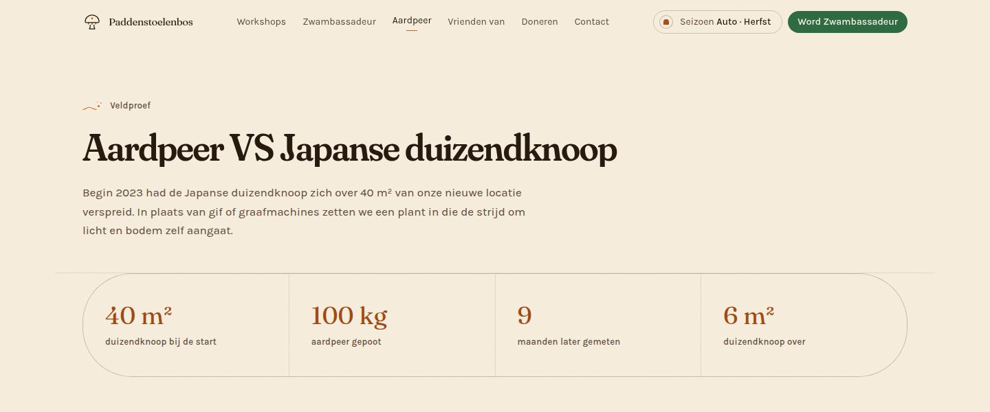
Stichting Paddenstoelenbos grows biodynamic mushrooms at the edge of the Tungelerwallen in Weert, and teaches people to do the same: workshops, walks, a supporter programme with its own coin, and a field trial against Japanese knotweed. The old site told all of that on one long page.
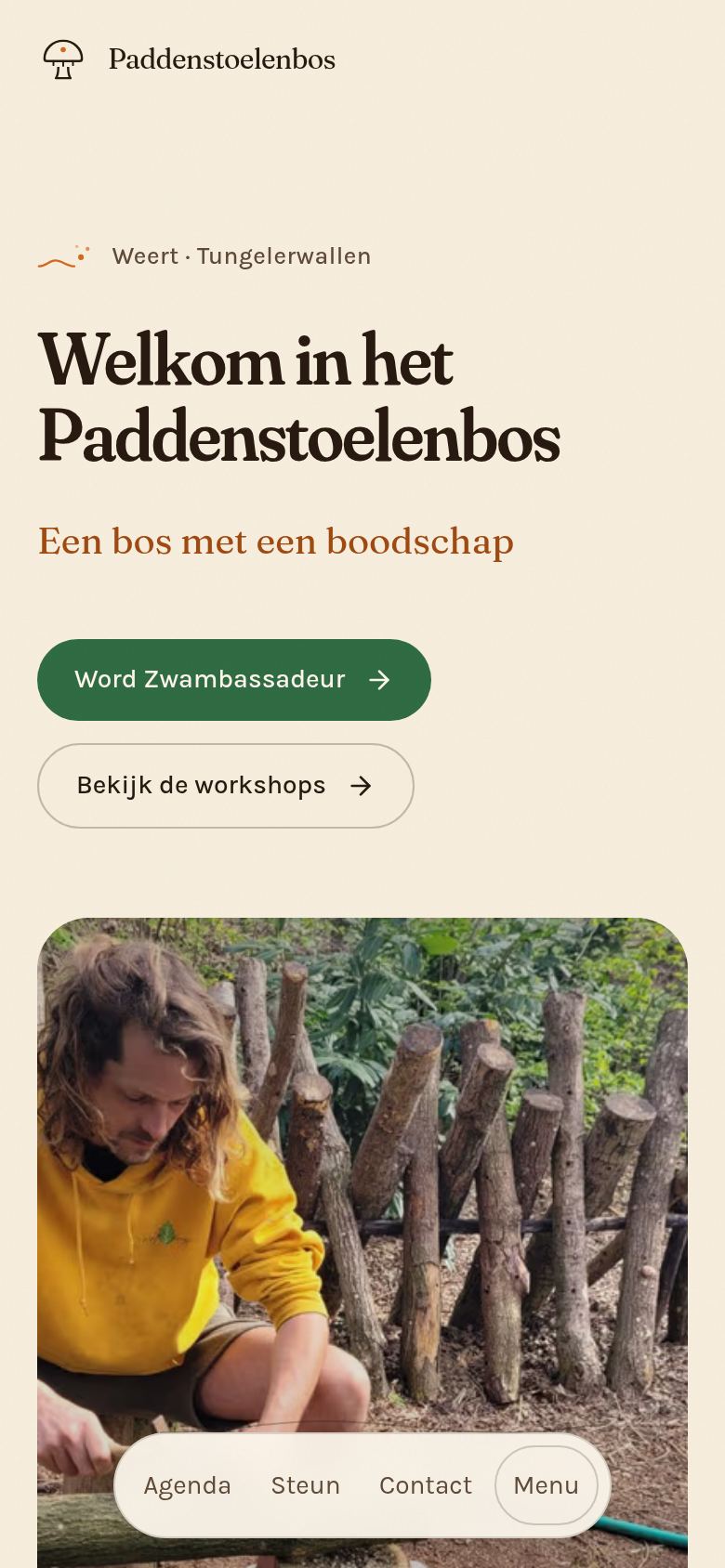
The people who visit come for three things: when the next walk or workshop is, whether they can pick something, and how to join in. So every section got its own page, and the forest's own voice (warm, a little strange, proud to be natuurgekkies) stayed exactly as they wrote it.
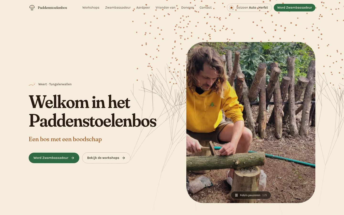
Screens
(02)Design choices
Colour
- Bosgroen#2F6B43Structure: buttons, the call to action
- Spora#D4691FInteraction: hovers, arrows, marks, lines
- Spora diep#B35213Spora as a surface under text
- Herfst#F7EEDEAutumn ground
- Crème#FDF7ECCards, and text on green
- Inkt#1C1710Ink
- Vlier#6B4A73Spore-print ornament, never a control
Type
- FrauncesHeadings, loaded as a true variable font so its SOFT and WONK axes can be turned up. That is what stops the page sounding like a prospectus.
- KarlaBody: a humanist grotesque with enough quirk to sit next to Fraunces.
Colour
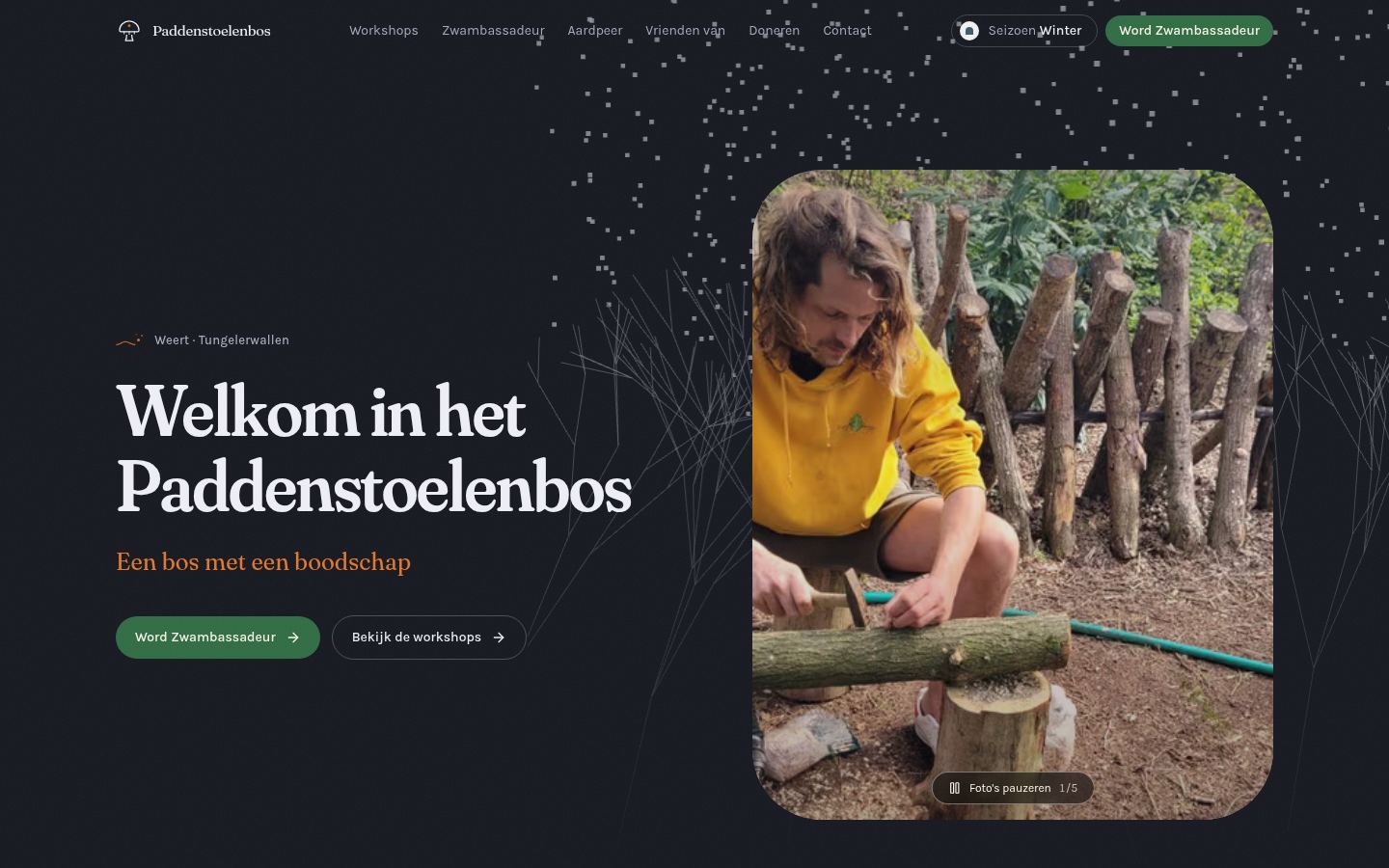
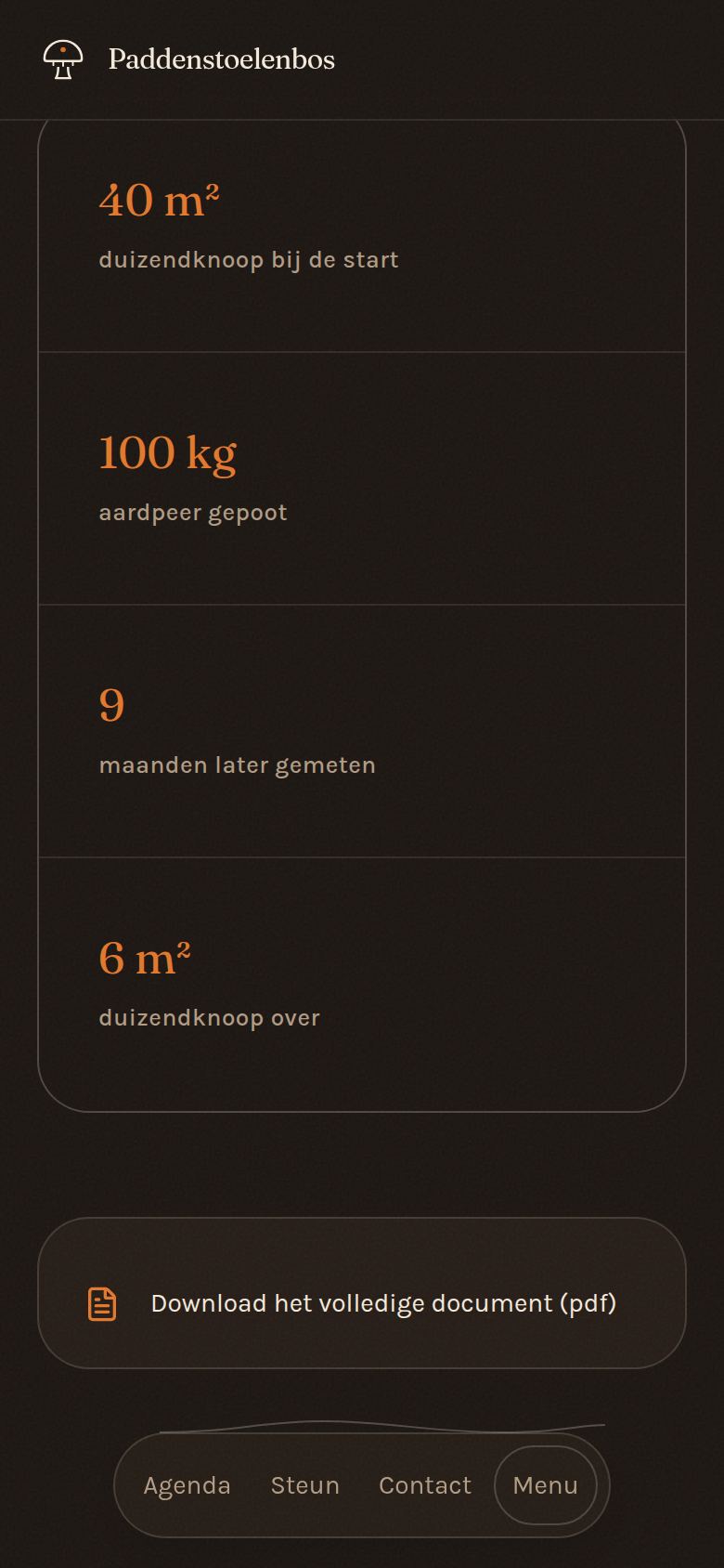
Hue follows the calendar and brightness follows the visitor's device. Four seasons (Lente, Zomer, Herfst, Winter) each have a day and a night half, so someone arriving in October finds a site that knows it is October. Forest green carries structure; Spora, named after the foundation's own coin, answers everything you can touch.
Type
Fraunces with its soft, wonky axes on every heading, and Karla for reading. Both are self-hosted, so a build never depends on a font server answering. Type, section rhythm and corner radius are all fluid clamp() values, with no width where the site sits between two designs.
Shape
Two shapes and only two. Every container (card, panel, photo) has the same large rounded corners; everything you can touch is a pill. Section seams are a drawn thread of mycelium, not a rule.
Motion
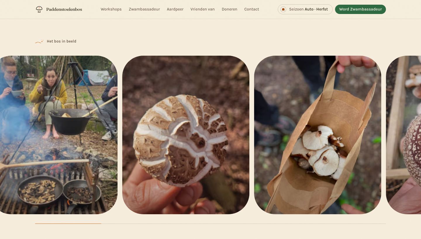
Every flourish is gated and every one stands down: an opening veil once per visit, a mycelium that grows behind the hero, galleries that the scroll moves sideways. Under reduced motion all of it stops, and the visitor can overrule their system in both directions from the footer.
(03)The approach
- 01
Every section of the old page got its own page with its own URL, in Dutch by default and English under /en. The old addresses that people already share still work, through permanent redirects.
- 02
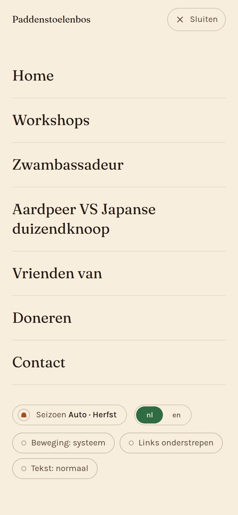
Four palettes, one per season, chosen by the calendar, each with a night half that follows the visitor's own dark mode. There is exactly one control: a button that says Seizoen.
- 03
The Dutch copy is the foundation's own text, carried over as written. Workshop dates stay on the booking platform, so the site can never show a stale date.
- 04
On a desktop the menu sits at the top; on phones a dock at the bottom holds the three things people come for (agenda, support, contact) plus a labelled Menu.
(04)The stack
- Next.js 16
- Every page prerendered in Dutch and English, with middleware that sends unprefixed paths to Dutch and keeps one canonical address per page.
- React 19
- One section shape for the whole home page, reused, so the page reads as one piece.
- Tailwind CSS 4
- Semantic colour tokens per season and per night half, and the fluid type and spacing scale.
- TypeScript
- All copy as typed Dutch and English pairs, each marked as the foundation's own words or a label the new structure needed.
- React Three Fiber
- The branching mycelium behind the hero, grown from a seeded generator so it is identical on every device.
- Framer Motion + Lenis
- Reveals, the scroll-driven photo rows and smooth scrolling, all switched off under reduced motion.
- Vercel
- Hosting, with the framework pinned in the repository so a new project can't mistake it for a static site.
(05)In the details
- 01
Their words, not ours
The Dutch copy is read from the live site and carried over as written. Each entry is marked as the foundation's own text or a heading the new structure needed. The terms and conditions stay in Dutch for every visitor, because the Dutch is binding.
- 02
No stale dates
Workshop dates stay on the booking platform that takes the money, and the site links to it. A second calendar would be a second source that could disagree.
- 03
Old links keep working
The field trial keeps the old site's own URL, and the renamed pages send permanent redirects, so links already sent out still land.
- 04
One control, with a name
The only switch on the site says Seizoen Auto · Herfst: you can see both that the site is choosing and what it chose. Pick a season and the calendar stops deciding until you pick Auto again.
(06) The outcome
Nine pages in Dutch and English, carrying the foundation's own photographs and film, each with alt text written by looking at it, and all eight colour grounds checked against WCAG AA.
Let’s talk
Let’s build
something uncommon.
A free, no-pressure intake call. You’ll leave with a clear scope and a fixed quote.